Hi everyone!
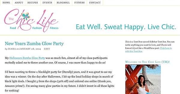
Just wanted to share quickly that I spent Sunday morning upgrading my blog template to the latest version, making it responsive. Woohoo! So, what exactly does that mean? My blog should now look great on any device you use it on: desktop, laptop, tablet, and phone. I’m hoping the change also sped up performance a little. I consolidated my sidebars and have worked really hard since Christmas to also trim things down in the back-end. (I’ll be sharing all the work I’ve done in a post on my tech blog)
I’m not 100% in love with the new look. I was going for a minimalist look, but I couldn’t quite get the CSS code to work how I wanted for the navigation bar, so after a few hours of research yesterday afternoon, I actually purchased a new framework and theme last night. It was just a little too late to try activating it. I resisted the urge to do so this morning before work since I still have to go to the office and wouldn’t be able to fix anything if it broke.
So, all in all, I think the new theme looks worse on desktop/laptop, but better everywhere else. I guess I’ll call that a win. 🙂 If anything’s missing from the sidebar that you used to use a lot, I am planning to add some features back in when I get the new theme up and going. Feel free to let me know what you were looking for in the comments, though. I’m also exploring what new features and functionality I can add when I have time to work on my blog again.
If you’re reading this through a reader, etc. you can click here for a direct link to https://thechiclife.com to check out the new look.
Thanks for reading!
Diana

